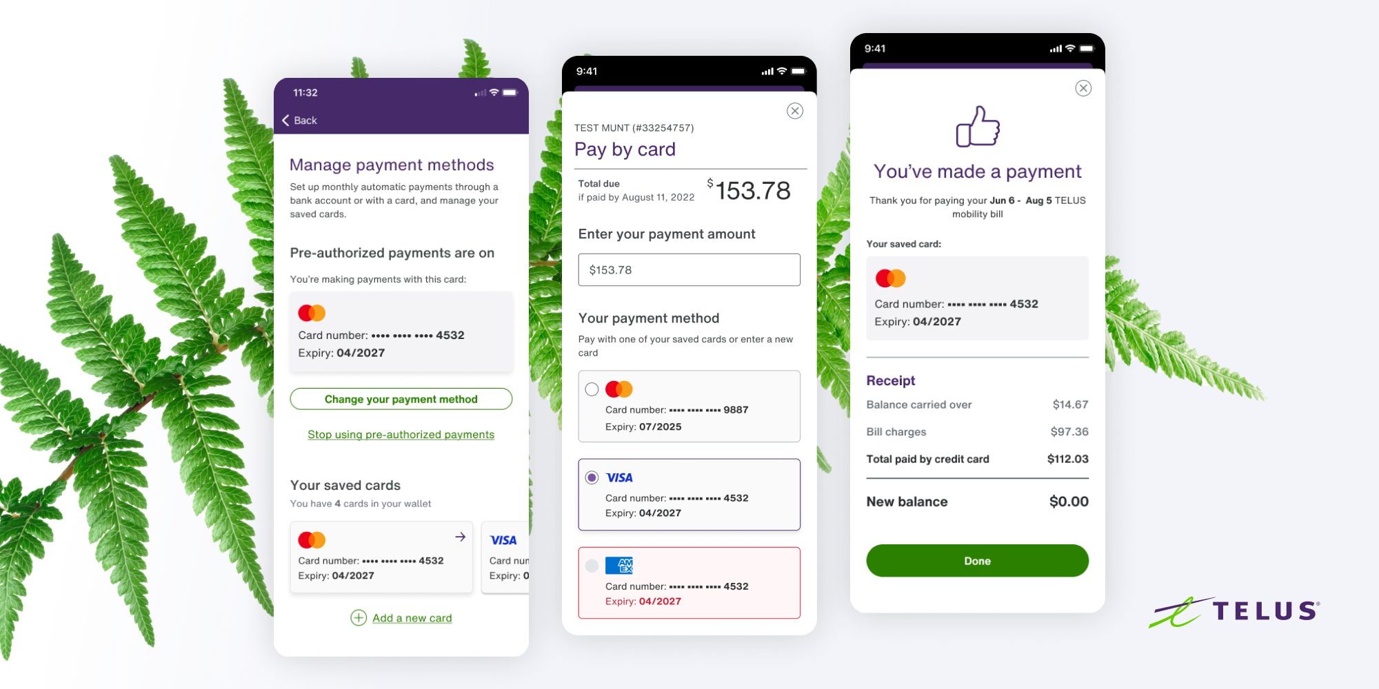
Rethinking the Payment Flow
Nascent Digital for TELUS
Role: Senior Product Designer
Responsibilities: Leading user research, wireframing, low and high fidelity prototyping, support hand-off and development of features, and any other design related tasks.
My Team:
Dan Lam – Product Owner
Sara Abuzinadah – Content Strategy & Writing
Prateem Shresta – iOS Development
Patricio Salazar – Android Development
Praveen Shiva – QA
The Opportunity
The in-app payment flow was to be migrated to a new platform.
This gave the product team A chance to update the experience and add a few more features.
Main objectives
BUSINESS
Improve payment conversions
Introduce a way for users to save and manage multiple credit cards
DESIGN
Make the payment flow cleaner and more intuitive
Introduce the new design system into the payment flow
Key solution elements
Quick and easy payments
Simplify the payment flow to make payments as friction-less as possible
Customers are in control
Payment options and their status should always be visible and clear
Expedite simple tasks
Reduce the amount of time and effort required for a customer to complete quick tasks
Promote trust with our users
The payment experience should increase our users’ trust in our brand and the service they are paying for
Design Exploration
I created multiple design iterations exploring different ways to select payment methods and save credit cards through the flow
We ensured alignment between design, business and development needs through constant communication and collaboration
Final Designs
One-time payment flow
Setting up Automatic Payments
Payment method Management
Figma Hand off
Final designs were cleaned up and annotated to provide context for the team’s developers. For this project, we decided to group screens per user flow.
Design QA and DEV Collaboration
Throughout the project I worked with the team’s developers to ensure the production build was as close to the designs as possible.


