*promo video not done by me
AI in Collect & WeTransfer
Nascent Digital for WeTransfer / Collect
Role: Senior Product Designer
Responsibilities: Leading user research, wireframing, low and high fidelity prototyping, support hand-off and development of features, and any other design related tasks.
My team:
Ed Sit – Project Manager
Sam McLoughlin, Joe Andrus – Design Support
Dave Allen-Johnson, Andrew Braini, Patricio Salazar – Development
Donall Johnston – QA
The Challenge
As part of WeTransfer’s push to enhance its creative tools, our team at Nascent was tasked with exploring how AI could enhance the experience across WeTransfer's four apps: WeTransfer, Collect, Portals and Paper.
We wanted to identify ways in which WeTransfer’s apps could work together more cohesively while leveraging AI to add real value for users. The ultimate goal was to improve platform-wide usability and test the impact of AI through a proof-of-concept feature.

Our Team’s Tasks
Identify how WeTransfer’s four apps can work together cohesively while leveraging AI to add value for users.
Test the impact of AI through a focused proof-of-concept feature.
Solving Task 1: How can AI add value to a cohesive WeTransfer platform?
This task required me to understand WeTransfer’s existing ecosystem and how their apps were being used. With this knowledge, I could then create a vision of a unified WeTransfer Platform with potential AI features. I broke Task 1 into the two problems below:
Problem 1: How can WeTransfer provide more user and business value by better integrating their 4 apps?
To answer this question, I started by comparing WeTransfers apps’ features to WeTransfer’s users’ jobs-to-be-done.
Step 1: Compare app features to user behaviour to identify potential points of integration.
Step 2: Group feature overlaps into themes and highlight their increased value when integrated.
Step 3: Propose potential strategies for an integrated platform.
Solution:
1. I identified key feature overlaps showcasing competition for user engagement within the WeTransfer ecosystem. I used these overlaps as indicators for potential integration points.
2. I grouped feature overlaps and into themes. This allowed us to show how integration between apps could provide user and tech value for WeTransfer.
3. Together with Sam - the design director for this project - we concluded by proposing 3 starting points showing ways to strategically integrate all 4 apps to form a connected platform offering.
Problem 2:
How would a platform offering work for our users?
How and where can AI provide value within a Platform offering?
This problem required me to create a conceptual platform user journey for WeTransfer with their two main user groups - ‘professional creators’ and ‘reviewers’
The journey I created follows a photographer who is working with a magazine editor.
1. The photographer shares a moodboard with the editor and they share ideas back and forth, collaborating on a shared vision for the photoshoot.
2. After the photoshoot, the photographer shares the photos and the editor to provides feedback
3. The journey ends in the photographer sharing the final photos and accepting payment for them all through the platform.
Solution
Through the conceptual user journey I was able to:
1. Show a starting point to imagine what the future could look like.
2. Pin-point moments in the journey where AI could be helpful.
3. Highlight other features that might need to be developed.
4. Show key platform-level points of consideration.
Solving Task 2: An AI Proof of Concept
Guided by our future vision, the team chose Collect as the testing ground to implement an AI feature. In Collect, I identified an opportunity to simplify the process of managing loose images and files by leveraging AI image recognition models to group them into Themes, that could then be saved as Boards.
The objective: Seamlessly integrate AI into Collect to help users Easily organize scattered images and files

To add an AI feature to Collect, it was important to follow these two principles:

Seamless integration
AI should blend naturally into the app's workflow without adding complexity or unnecessary steps.

Keep it simple
Embrace consistency by following Collect’s minimally easy and intuitive usability patterns and user interface.
Design & Development
Bringing this proof-of-concept to life depended on close collaboration between design and development. We worked through lighting-fast sprints to fail and learn quickly. The two main components I focused on where:
User Interaction Patterns: Does the UX & UI feel as simple and easy to use as possible? How can I push some boundaries?
Image Recognition Models: Which model groups images into the most human/usable themes?
1. User Interactions Patterns
Working fast allowed me and the team to prototype (figma) and build (testflight apps) many iterations of the experience. Below are some of the concepts we tested:
Concept 1
Aimed to simplify creating boards or discarding themes by adopting a swipe right/left interaction to create or discard.
Why it didn’t work:
Users found editing a theme hard to find and difficult to interact with.
Concept 2:
Focused on allowing the user to easily edit the grouped themes before creating a board with the selected images.
Why it didn’t work:
The overall experience became too complicated with too many actions presented at once
Concept 3:
I split the flow to simplify user actions:
Part 1. Select all desired themes
Part 2. Review/Edit themes
Why it didn’t work:
Although users found selecting and reviewing to be respectively easier, the overall flow became harder to understand.
Concept 4:
I hypothesized that placing the review/edit mode in a sheet would make the overall flow easier to follow.
Why it didn’t work:
We identified the main point of confusion was requiring users to select ALL themes they liked before the review/edit stage.
2. Image Recognition Models
Through a lot of testing, The team and I found the main challenge with image recognition models to be the naming that each model would give a theme. Many times using names that were incorrect or sometimes using names that most people would not understand – ie. naming a theme ‘Ungulates’ for images of animals with hooves.
For the final solution, we chose to use the model that had the highest average number of correct image groupings and decided against suggesting theme names.
Examples of bad AI theme naming
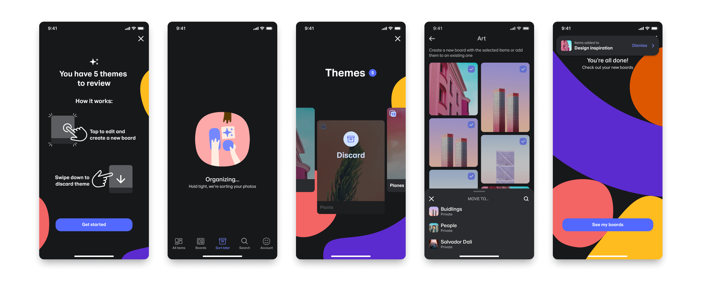
Final Designs
This was the first AI feature introduced anywhere in Collect and the WeTransfer ecosystem, so we made sure to emphasize it with a carefully crafted loading experience created by Joe (Senior product designer)
For the final user interaction I:
1. Landed on a left/right swipe interaction to scroll through themes
2. Added a swipe down interaction to discard themes
3. Reviewing/Editing was moved to a secondary screen.
This solution not only performed best in user testing but also stayed true to Collect's core value of simplicity.
To bring out the playful spirit of the Collect brand, I added fun micro-interactions and animations throughout the interface
I used Jitter to create Lottie animations that could be easily added in. The two that stand out the most to me is the ‘parallax’ type motion on theme scrolling and the falling brand shapes on the success screen.

Developer Hand off
I cleaned up the final designs and annotated them to provide context before handing off to the team’s developers. I also provided an information architecture diagram to ensure the user flow was clear.
The development process was highly iterative, with constant review and QA sessions to ensure the final product matched our teams goal.
Results
The outcome was an AI feature that transformed how users interacted with Collect:
First AI Feature Launch: This was the first AI-driven feature within Collect and across WeTransfer's entire ecosystem.
Positive User Adoption: Post-launch feedback highlighted increased engagement and user satisfaction, with many users praising the ease of organizing their creative assets.
Foundation for Future AI Integration: This successful launch demonstrated the potential for thoughtful AI integration and set a precedent for future AI-driven initiatives at WeTransfer.
Takeaways
Like any solution, adding AI is only valuable if it helps users solve a real problem.
Choosing the right AI model was key to the user experience. Due to budget constraints we had to use the best FREE model available. A paid model might have provided better theme naming results.
Not waiting for designed or coded prototypes to be ✨ perfect ✨ allowed for ideation and testing to happen faster. This cross-functional collaboration helped us launch the feature in a very limited time.
Approaching system-level design by analyzing WeTransfer’s complex ecosystems and identifying opportunities for integration first, helped align all stakeholders, making the proof-of-concept possible.