Nulogy - Case Studies
As a Product Designer at Nulogy, I was responsible for identifying, analyzing, and communicating user, business and design requirements to all product stakeholders. I lead user research and user testing sessions to inform the creation of project success criteria and the design of workflows, domain models, story maps, sketches, wireframes and prototypes.
As part of the Nulogy Design team I lead the design of Nulogy’s QCloud and was one of four designers responsible for the product design of Nulogy's core application, PackManager.
PackManager is a materials planning, production, inventory and order management application. QCloud is a cloud based quality control application for packaging and manufacturing operations. Together they are an industry-leading, versatile, end-to-end solution for any co-packing operation.
Below are a few case studies on some of the work I did during my time at Nulogy.
Case Study 1 | Compliance User Research and Problem Definition
Background:
As the packaging and manufacturing landscape evolves, there is an increasing need for customized products within strictly regulated industries. To continue being a world leading contract packaging solution, it became clear that market, regulation and customer research needed to be done in order for PackManager and QCloud to support workflows in these environments.
Charter user groups and on-site workshops:
Given the magnitude of the project and the anticipated changes to Nulogy’s platform, a charter user group (consisting of users within Nulogy’s biggest customers) was put together to help the team understand user requirements and to provide feedback throughout the design and development process.
A Nulogy multidisciplinary team (consisting of members from the product development teams and consulting teams) then participated in an onsite engagement in the UK with one of our biggest customers packaging products in a highly regulated environment. Through this workshop, we ran collaborative discovery exercises to better understand our end users' workflow, their pain points and how they would use Nulogy’s platform.
My role within the disciplinary team was to lead the design part of our research sessions and record all discoveries from a user and design perspective.
User Research:
We decided to follow an “Event Storming” discovery type session to uncover who the users where, the user journeys, workflows and gaps within the Nulogy platform.
Event storming is an extremely lightweight workshop-based method to quickly “storm out” a series of events to find out how each user is acting upon a specific domain/software program. The main idea is to bring “domain experts” and product development together to build shared understanding and context.
Communicating our research: Users
Back in Canada, I put together a high-level description and hierarchy document displaying the responsibilities of each user role.
This helped every agile team member understand who the end users were and what their overall goal was during the packaging process.
Communicating our research: Operation and User workflow
The event storming discoveries were first mapped as a high-level step-by-step workflow to help all agile teams understand the overall process.
I then put together each user's tasks within the step-by-step workflow to give the teams an overall understanding of how each user role interacted with each other and how each role affected each step of the packaging operation.
Defining the problem(s)
To better understand the how our users’ workflow would fit into the Nulogy platform, we broke down the workflow into PackManager and QCloud domains.
Once the workflow was broken down, we could more easily see the high level pieces of work that we would have to do in order to support our customers operating in these types of industries. We created a user story map (shown below) to classify and prioritize each body of work. These high level stories were then distributed to 4 agile teams to work on.
Outcome
As we gained increased alignment with our customers on a prioritized implementation plan, we refined all solutions into smaller bodies of work, each of which were then subsequently broken up into user stories containing acceptance criteria and UI/UX requirements. We maintained weekly calls with members of our charter user group in order to gather feedback on developed functionality.
Through this work, Nulogy was not only able to support increasingly complex and more strictly regulated workflows, but also gain the confidence of some of the world’s biggest and leading CPG’s. This confidence led Nulogy and its customers to form tighter relationships, the signing of new contracts and the creation of new partnerships enabling the development of more innovative solutions for the supply chain industry.
Case Study 2 | Regulatory Compliant Inspections
Background:
As Nulogy looked to serve customers within more regulated industries, we were asked to make changes to our applications to meet the demands of these new industries
Problem 1:
QCloud could not provide proper traceability of who filled an inspection or a sheet, given that we allowed multiple inspectors to collaborate on inspections and did not keep a record of changes made to an inspection while being filled out.
Problem 2:
FDA and European regulations do not allow digital records to be deleted. QCloud allows inspections to be deleted at multiple points throughout the application. And inspections are records... sometimes.
Understanding User Data:
Through Pendo (a usage tracking application) and user research calls, we were able to identify key metrics that could impact the overall solution
Customer surveys/calls
“Inspectors here are quite busy. I need a solution that enforces the proper procedures so that my inspectors can focus on elevating our QA standards” – QA Director at 3PL
“We can’t adopt QCloud in some parts of our organization because it does not ensure the proper traceability of who fills an inspection or sheet” – QA Lead at CPG
Problem 3 (!!!)
Through analyzing user data and talking to more users, we realized that lots of them would change the header section of a Sheet which allowed multiple inspections AFTER an inspection had already been submitted.
As we learned more about FDA and European regulations we realized that in order to be compliant we would need to provide a way for multiple users to fill different inspections for a sheet but NOT allow them to change the header information.
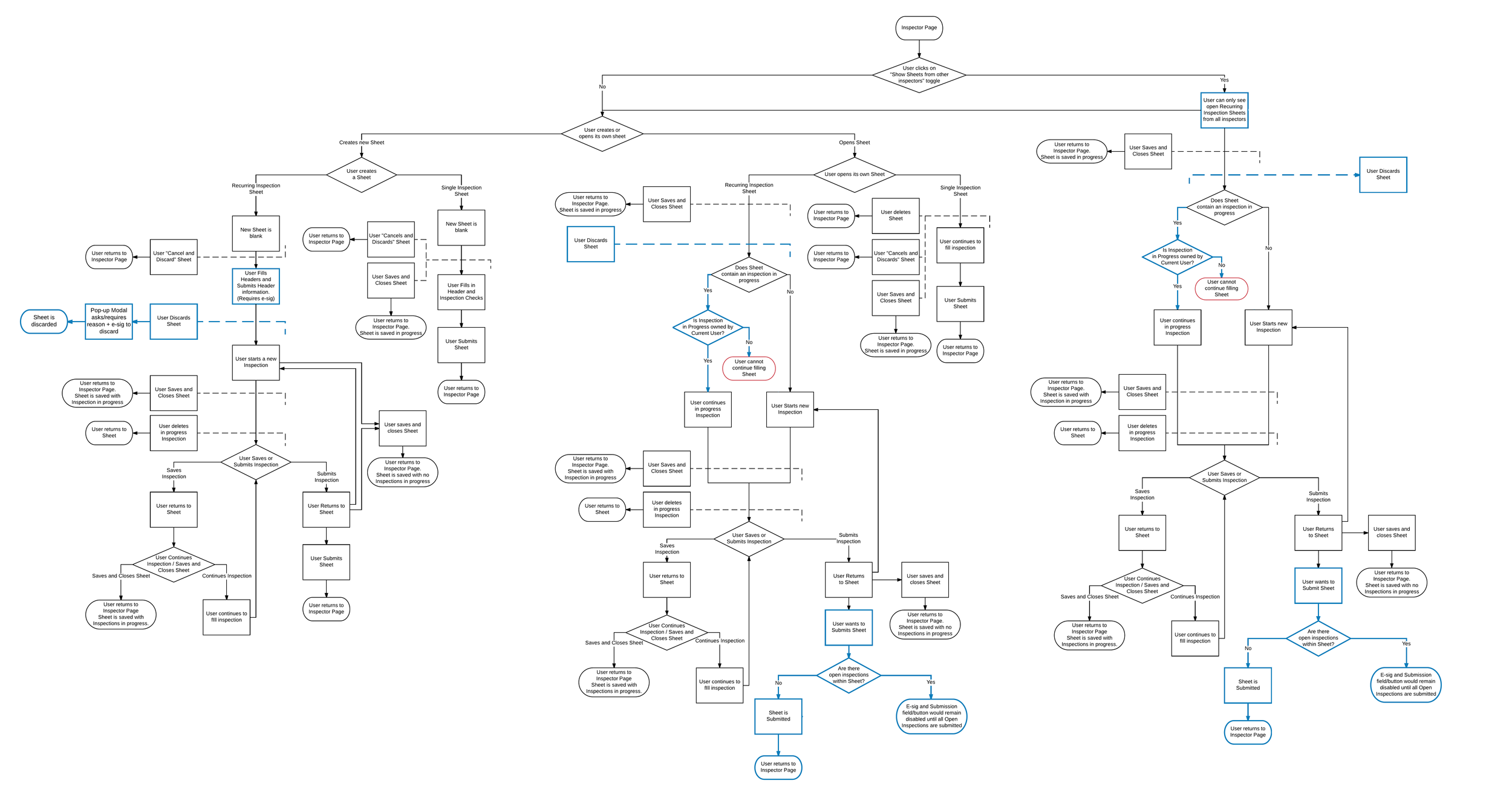
Workflow Mapping
Through the mapping of all inspection workflows we were able to see:
That inspections only become records after being submitted
A Sheet should only be able to be deleted before a header or an inspection is submitted
How and where an inspection discard workflow could fit in the application.
The appropriate points in which to disable user collaboration on inspections
An easy way to “submit” Sheet headers in Sheets that allow more than one inspection
The workflow was eventually simplified - reducing the number of collaboration points, inspection deletion instances and adding a sheet discard workflow.
Preventing Collaboration and Submitting Headers
OLD Inspection UI:
New Redesigned Inspection UI:
The final design focused on replacing the Save/Edit Header button with an in-line Header submission form, and the submission information after the header has been submitted.
Inspection collaboration was limited by only allowing a user to continue an inspection if they started it. Only one open inspection is allowed per sheet to reduce the potential error of multiple users simultaneously filling an inspection through different devices.
Discarding a Sheet
A "Sheet Discard" functionality was introduced allowing users to put aside sheets and inspections that are no longer useful.
Because the discard action requires users to enter a reason for discarding, we decided to go with an error-preventing flow - disabling the password field if no text has been entered in the “discard reason” input field.
Case Study 3 | Navigation AND USER PERMISSIONS REDESIGN
Background:
QCloud worked with a fixed set of 3 user roles (manager, supervisor and inspector). As our QCloud customers became more sophisticated, so did their company structures and it became apparent that our user role model could not support the types of user permission sets our customers were asking for.
Problem 1:
We needed to provide new user roles/permissions set to match our increasingly complex customers company structures. Our solution had to be flexible enough to adapt to each of our customers’ demands
Problem 2:
Historically, QCloud was designed to have divided desktop and mobile interfaces. Through researching device usage numbers, it became evident that ~70% of our user were using desktop intended pages on mobile devices. This would only become worse as increasing flexibility in user roles would lead to more users using QCloud on mobile devices. As part of this work, we had to find a way to create a seamless experience between both interfaces.
Customer Feedback:
“I can’t adopt QCloud throughout my organization because I can’t give the right amount of access to each of the roles here“
– Head of QA North America at CPG
“I need to let my inspectors run inspection reports but I can’t upgrade them to a ‘supervisor’ role because they should not be able to accept or reject inspections” – QA Manager at 3PL
Creating Permission Sets:
After much research, we decided to go with an RBAC (Role Based Access Control) like model, where users belong to user groups with different permission sets
Our user permission model allows a special user to create user groups containing any combination of fixed permissions sets
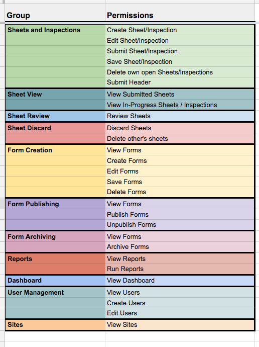
To create permission sets, we mapped out QCloud actions and grouped them.
These groups were then tested with key customers user permission structures to make sure they were robust enough
Customer example of permissions needed per functional role
Final Design - User Permissions:
Creating a User Group:
A User Group page was created to give user administrators the ability to create and manage user groups. The create/edit user group modal layout follows our existing visual language, providing toggles to turn on/off each permission set for a specific group.
(Click to expand)
Creating/Editing a User:
The User creation flow was updated so that users can be assigned to a user group. We decided to add help text to the user group drop down to provide a quick way for users to know the allowed permissions of each user group. The table in the Users page was also updated to include a User Group column.
(Click to expand)
Conceptualizing and Testing - Navigation
Because the information architecture was not changing, the work was focused on the user interaction with QCloud’s navigation.
A few of the ideas were mocked up and tested both internally and externally to find the best possible solution. The best performing idea was then polished to create the final design.
Navigation - Final Design:
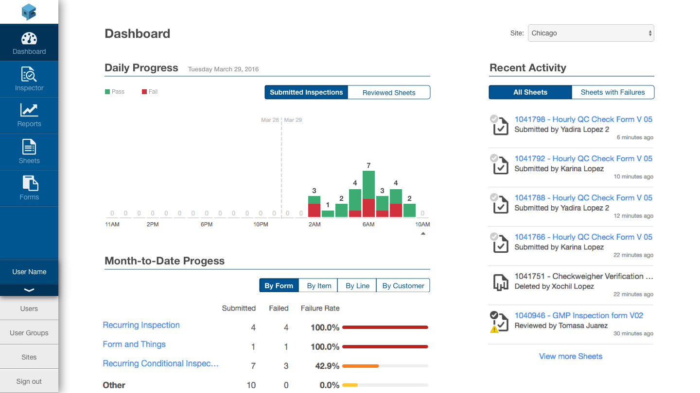
The final design made for a smooth responsive transition from desktop to mobile. Keeping a consistent UX pattern and visual language was imperative to ensure users were able to keep the same mental model regardless of the device they were using.
(Click to expand)
Desktop Navigation:
Mobile Navigation:


