
Public Mobile
Nascent Digital for Public Mobile
Role: Product Designer
Responsibilities: Lead user research, wireframing, low and high fidelity prototyping, and support hand-off and development of features and any other design related tasks.
My Team:
David Jarvis, Ed Sit – Project Managers
Julianne Lee – Product Owner
Linda Nakanishi, Marcy Peterson — Design Support
Mike Gauthier, Priyam Brahmbhatt, Kaeto Ndu – Development
Rimple Vandra – QA
The Opportunity
Public Mobile is an online, self-serve only, telecom company in Canada. As they have grown in popularity, they realized that they needed to modernize and update their SIM card registration process and their account management portal to better serve their customers

Main Objectives
Create experiences which are user friendly to a growing, new immigrant, customer base
Introduce Public Mobile’s new branding guidelines to each of the experiences

.
Case Study 1: SIM Card Activation
Objective:
Increase the number of completed SIM card activations by making the activation platform more intuitive and user-friendly for consumers and store dealers
User research
The project started by interviewing Public Mobile dealers to better understand how to improve the SIM card activation experience. I visited 5 dealers at their workplace and asked them to walk me through their current activation process (with Public Mobile and their competitors), frequently asked questions, and common pain points.

The objective was to fully map the in-store SIM card activation process from both a consumer’s and a dealer’s perspective.
Through the journey map I was able to identify all pain points in the flow as well as the consumers’ and dealers’ sentiments.
Based on the results of this exercise, the team made the decision to design two end-to-end SIM card activation flows - one for consumers and one for dealers. Ensuring all users had the best experience possible.
User testing
Throughout the project, I collaborated and tested multiple concepts with key stakeholders – Public Mobile SIM card dealers and regular consumers.
I conducted 8, scripted, user testing interviews using userzoom.com and analyzed all insights and relevant observations to improve our design and content direction.

Final Design
Consumer Flow - Simple and Guided
The consumer experience prioritizes a guided flow that offers users help throughout the way. I made it easy to for first-time users to understand what information Public Mobile needs from them at each step and kept the pages simple to reduce the cognitive load of each of the steps.
Dealer Screen - Quick and Easy
The Dealer experience plays to their strengths as ‘power-users’ of the platform. Keeping all necessary steps in one page made the SIM card registration simpler and quicker as Dealers are able to scan and tab through each of the input fields effortlessly.

Case Study 2: Account Management Portal
.
Objectives:
Increase monthly usage of the account management portal by making self-serve actions easier to access and more intuitive to complete.
Update their UI style guide - including colour guidelines, text styles for both web and mobile use, and new UI components.

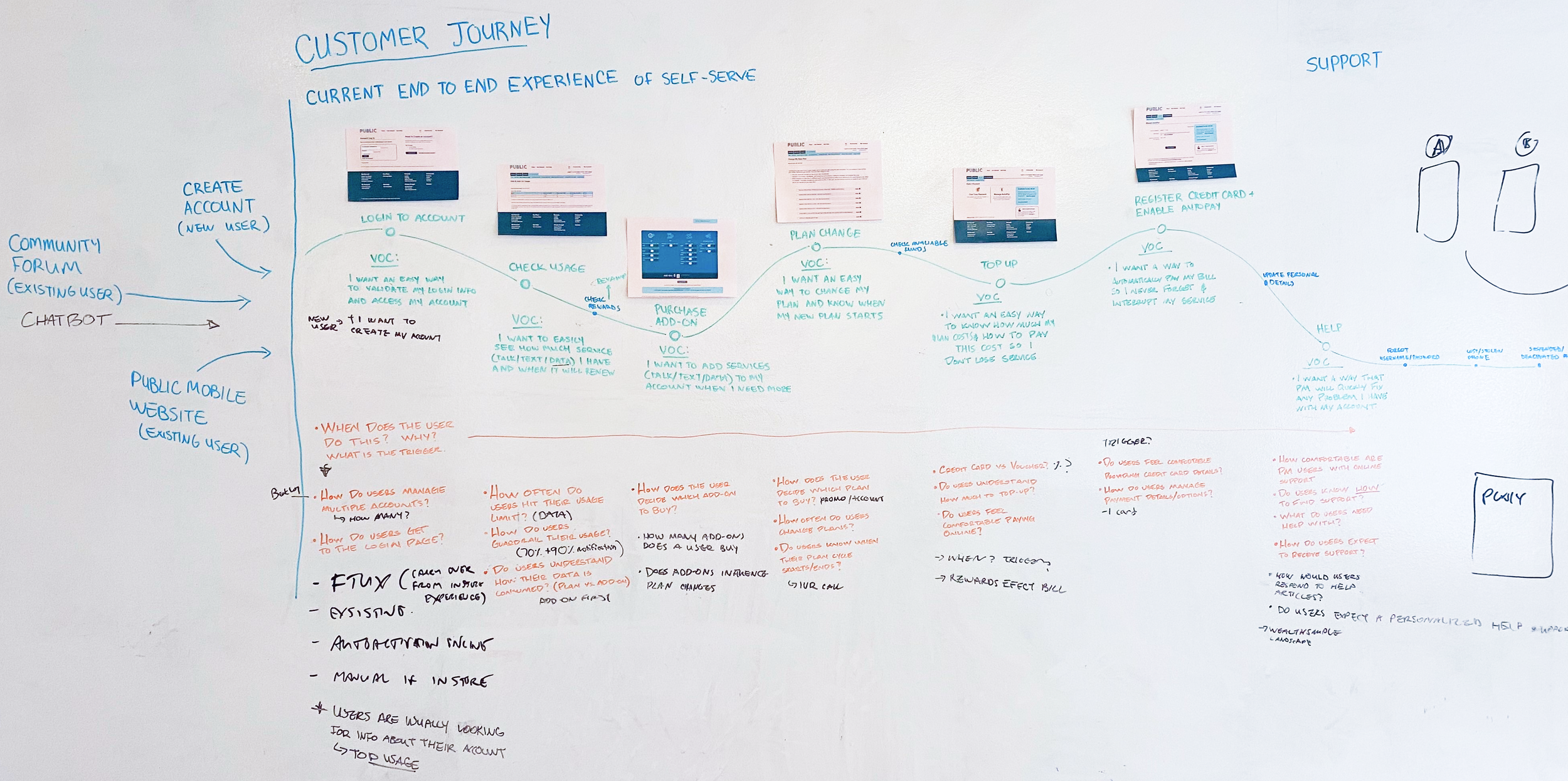
Journey Mapping with Stakeholders
The project started by bringing together the main Public Mobile stakeholders to help me and the Nascent team put together a high-level journey map of the existing account management portal.
Initial Explorations

Information Architecture
Throughout every design iteration, I mapped every page and feature needed in the account management portal. I kept this document updated as requirements were refined.

User Research
Once the team and I were comfortable with a design direction, I conducted 10, scripted, user testing interviews using userzoom.com. These user testing sessions gave us valuable insights and observations to improve the UX/UI of the account management portal.

Testing Script

Insights and Observations
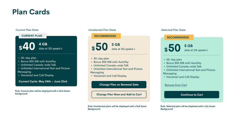
Final Designs
Desktop Screens

Login & Onboarding
Landing Screens

Feature / Action Screens
Creating a UI style guide
Public Mobile had just introduced their new branding guidelines before our engagement with them. However, their new guidelines were not robust enough to fully cover complex sites and flows like the ones we were asked to tackle.
This created the opportunity for me to use the branding guidelines to create a more robust UI style guide.
Colours


Example of Components


Typography

