Billing Page Redesign
Nascent Digital for TELUS
Role: Senior Product Designer
Responsibilities: Leading user research, wireframing, low and high fidelity prototyping, support hand-off and development of features, and any other design related tasks.
My Team:
Diana Hu – Product Owner
Linda Nakanishi, Dio Wong — Design Support
Sara Abuzinadah, Tiffany Moreside – Content Strategy & Writing
Jas Lamba, Samuel Junior – iOS Development
Patricio Salazar, Courage Eboigbe – Android Development
Dennis Wang, Jorge Ramirez Landa – QA
The Problem
Users are having trouble understanding their bill, leading to lots customers support calls.
Main objectives
Business
Reduce the amount of customer support calls by making the billing experience easier to understand
Design
Simplify the billing experience
Make self-serve actions more accessible to all users
Introduce the new TELUS brand guidelines to the app
Key solution elements
Make the bill understandable
Simplify the bill breakdown and allow customers to reveal more information when necessary
Empower customers to take control
Customers should not feel or be caught off guard at any point of their journey.
Expedite simple tasks
Reduce the amount of time and effort required for a customer to complete quick tasks
Promote trust with our users
The billing experience should increase our users’ trust in our brand and our service
Initial Exploration
The design process began with conceptual designs refined through multiple stakeholder meetings to ensure alignment before landing on the first prototype ready for user testing.
We skipped the wireframe stage and began with mid-to-high fidelity designs to quickly experiment and find out how the new branding could be applied to the new UI elements.
User Testing
Throughout this project we conducted 3 moderated usability tests and one A/B test. Below is a summary of the two main user tests:
User Test 1
User test 2
Final Designs
Throughout the entire process, I worked with Product Management to make sure all use cases were considered. Continuous collaboration with the development team to ensured the designs utilized our backend/frontend capabilities effectively.
Bill Landing Screen
We were able to keep the bill landing screen clean and to the point while still including TELUS’ new branding guidelines to it.
Bill breakdown Screen
The bill breakdown was moved to its own screen so users can focus on finding the information they need
Billing states
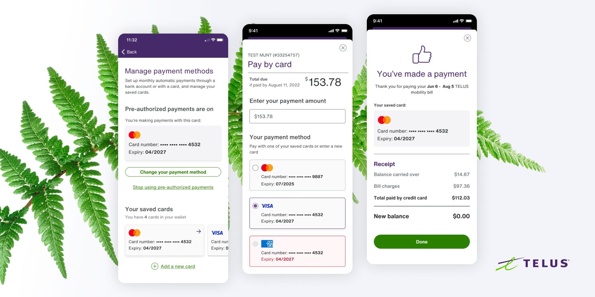
Automatic Payment Card
Change for good card
Results
Business Outcomes
247k projected reduction in billing related support calls per year.
$3.5 Million in yearly savings due to support call reduction.
Design Outcomes
4 out 5 high value self-serve actions had an increase in click rate.
7 new app specific design system components were created.
Learnings
How to balance stakeholder and user feedback and expectations to identify innovative ways of communicating sensitive information to users
The importance of knowing when to use a specific user testing methodology to understand where potential improvements can be made
System-level thinking to design reusable components for a mobile/native platform


